
Snaggle - App UI Design
Snaggle isn't just another dating app; it's a dedicated platform for goblins seeking something significant beyond fleeting encounters. We understand that even the most mischievous of creatures yearn for genuine connection, shared understanding, and a bond that goes deeper than just a bang.
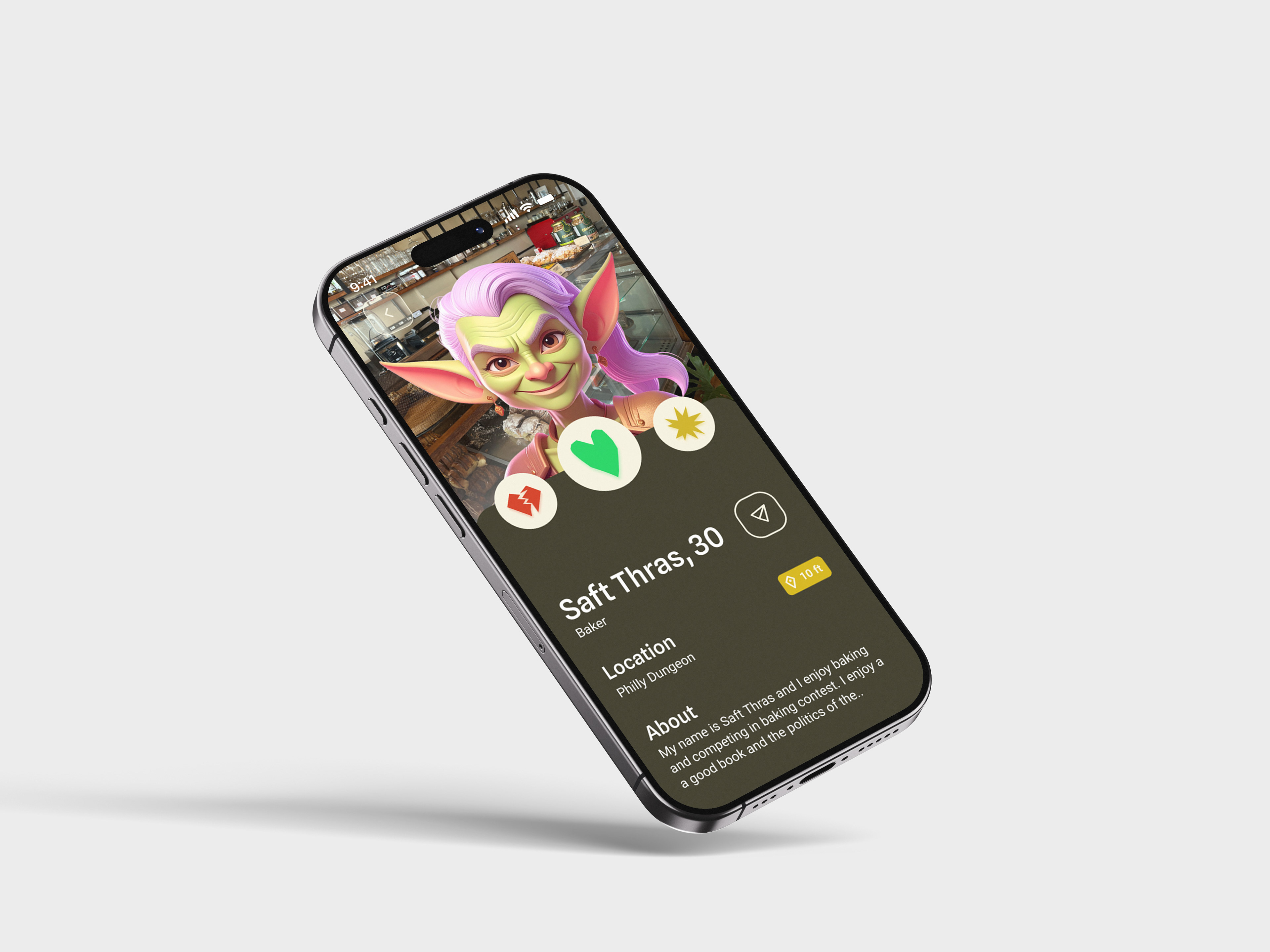
App on an iphone
The Process
I began by thoroughly understanding who the user is and their specific requirements for finding love. This involved delving into their background, values, and relationship goals to effectively support their journey in finding a meaningful connection by creating a user persona that helps us get into the mind and understand who the user is.
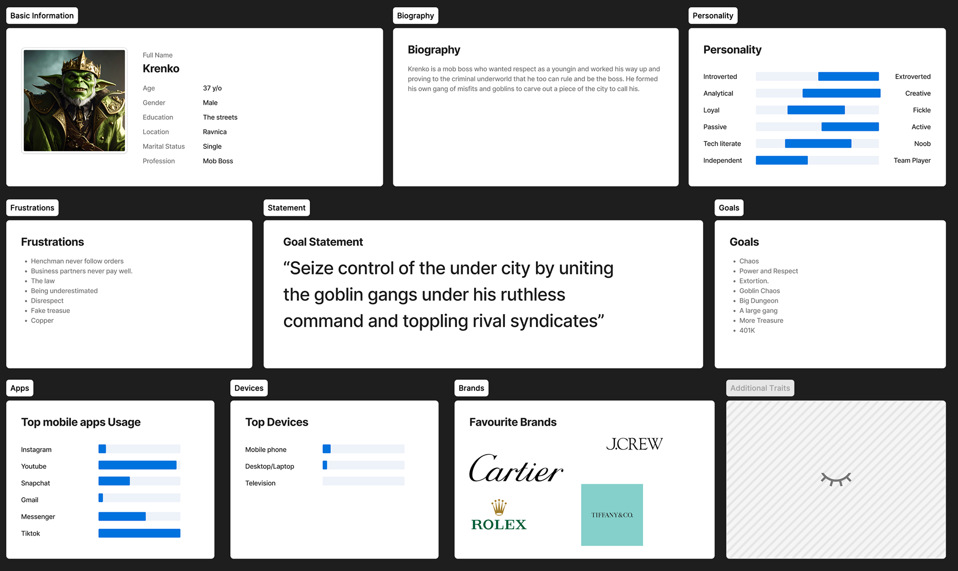
User Persona
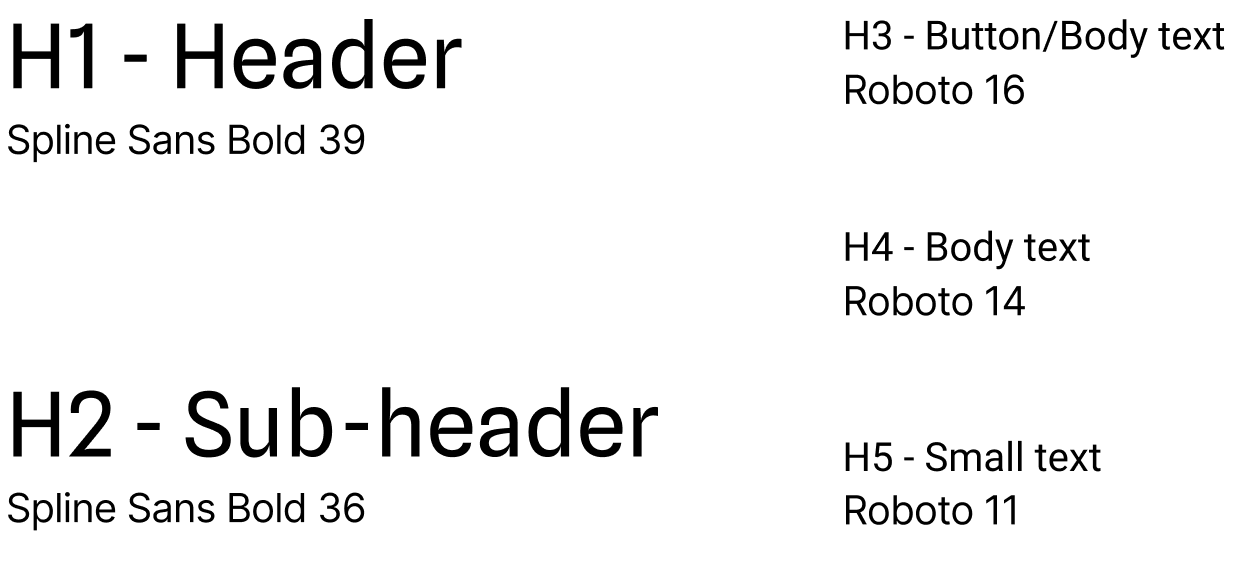
Typography
I chose Spline Sans for headers and sub-headers and Roboto for body and button text. Spline Sans provides a modern, readable look for titles, while Roboto ensures clarity and legibility across all main content. Both fonts were picked for their utility and clear readability, making the interface straightforward for users to navigate.
The deliberate pairing of Spline Sans for hierarchical elements and Roboto for detailed content reflects our commitment to prioritizing user experience. Both fonts were chosen specifically for their inherent utility and clear legibility, ensuring that users can effortlessly digest information and interact with the platform.
Color Palette
To match the user persona, I chose a dark, dirty, and grimy aesthetic, primarily using gold and its shades for the dark mode background. This gold, along with a secondary green, is also used for buttons and navigation cues, ensuring visual consistency and reinforcing the desired theme throughout the interface.
Further reinforcing this theme, both the primary gold and a carefully selected secondary green color have been strategically applied to interactive elements like buttons and navigation cues. This ensures visual consistency and reinforces the persona's desired aesthetic throughout the interface. The green complements the gold, adding a subtle touch of natural earthiness that enhances the overall "dirty" and "grimy" feel, while still maintaining clarity and functionality for user interactions.
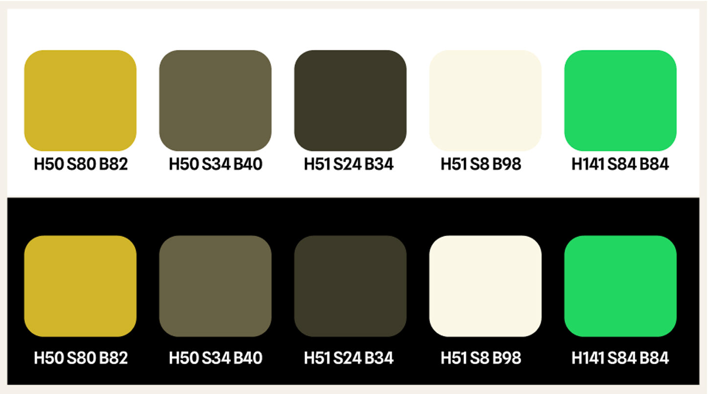
Color palettes
Components
I carefully selected a color palette that aligns with the user persona, leaning into a dark, dirty, and grimy aesthetic. I achieved this by primarily using gold and various shades of gold for the dark mode background, creating a rich, aged, and somewhat rugged feel. To maintain visual consistency and reinforce this theme, I also incorporated gold tones, along with a secondary green, for interactive elements such as buttons and navigation cues. This ensures the interface feels cohesive to the user in the intended experience.
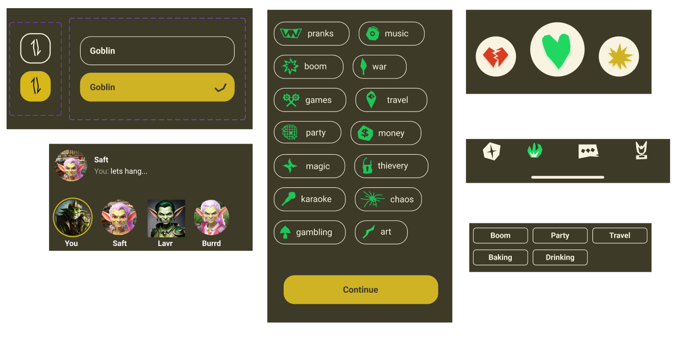
App components`
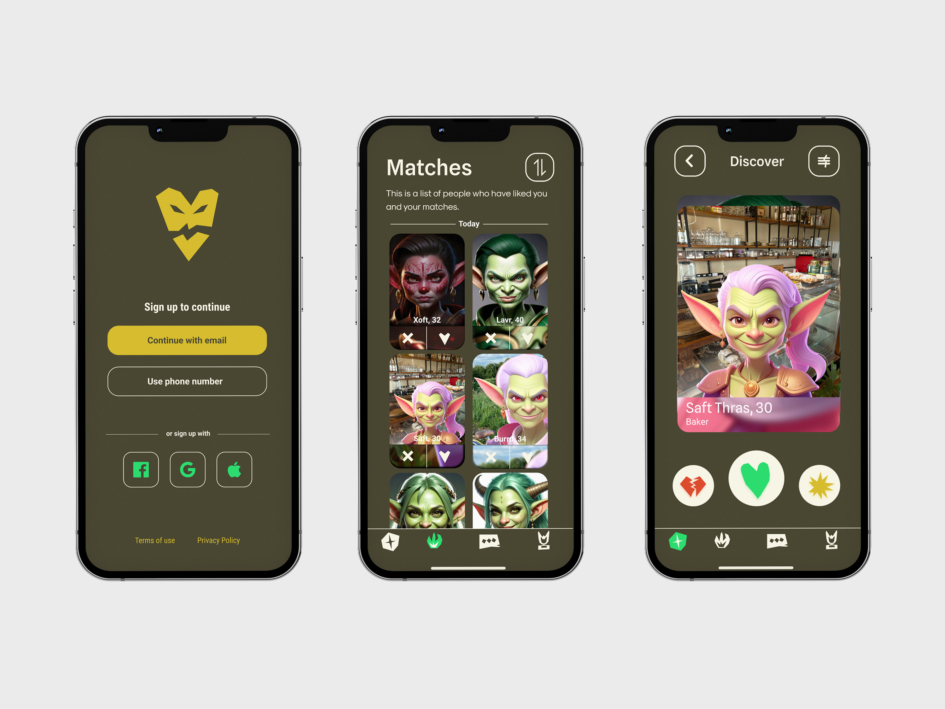
Final Design
This final design meticulously brings together every element—colors, typography, and interactive components—to create an app that deeply resonates with its unique audience. We've crafted an experience that speaks directly to the demographic of goblins and genuinely supports their quest to find meaningful connection.
The strategic choice of dark, grimy golds for backgrounds, accented by a secondary swampy green for key interactive elements, immerses users in an aesthetic that feels inherently "goblin." This isn't just a stylistic choice; it creates an environment where users feel understood and visually at home.
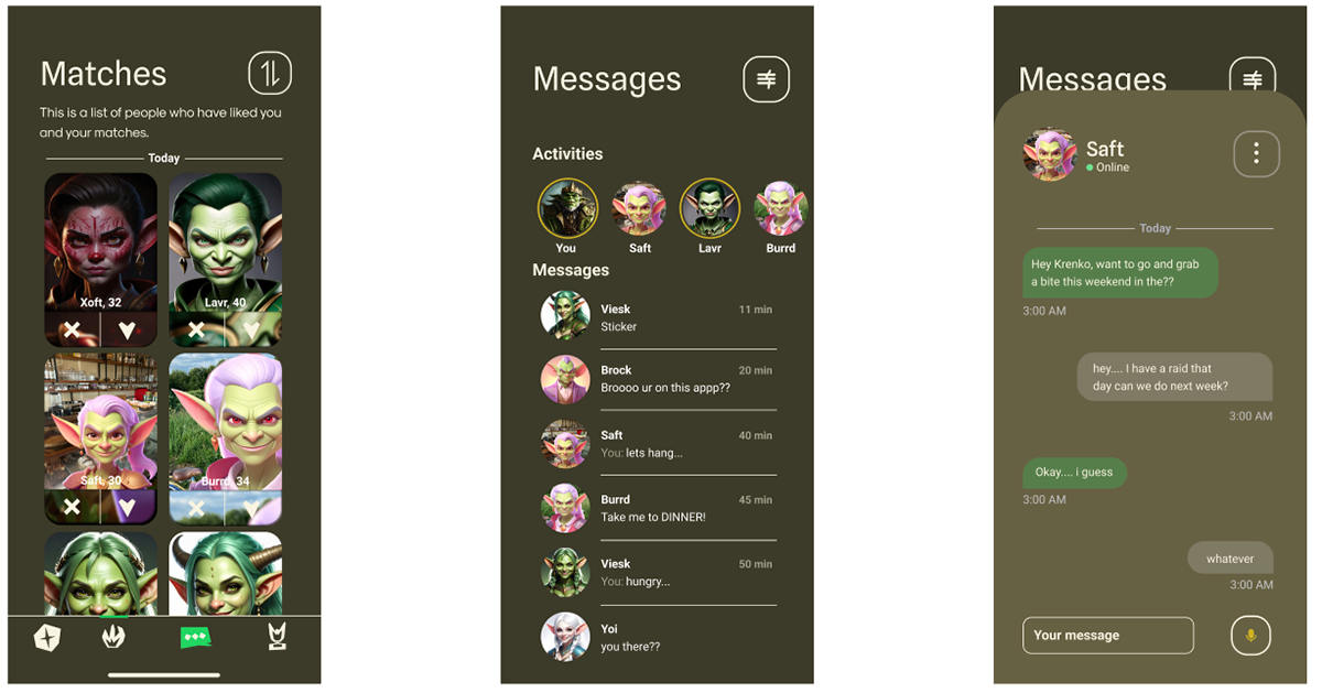
App layout
App layout displayed on smartphone
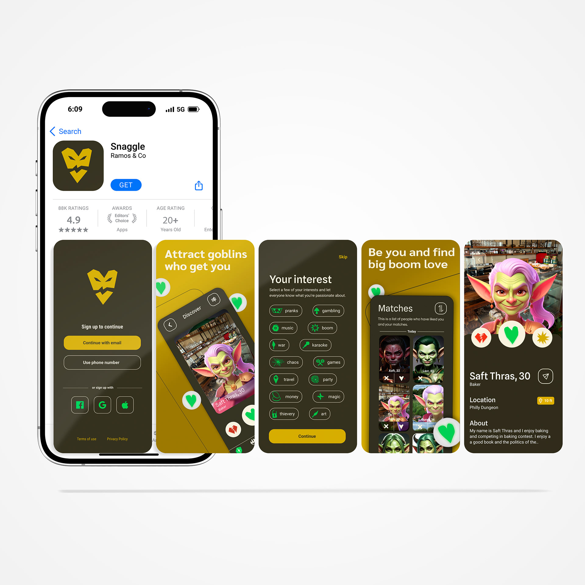
App display in app store
App Functionality